Hyper Island – Helping Users Find Their Path
An accessibility-focused UX project centred on clarity, structure, and user understanding.
Accessibility • Information Architecture • UX Strategy

The Challenge
Hyper Island offers a wide range of programmes, courses, and educational pathways across digital development, UX, business, and leadership.
While the website is visually engaging and brand-driven, finding the right programme can be challenging, particularly for users unfamiliar with the education landscape or those with cognitive accessibility needs.
The project focused on understanding how information structure impacts navigation, comprehension, and decision-making.
[Image Placeholder: Hyper Island homepage or current navigation]
Problem Definition
The core issue was not a lack of content, but the difficulty of making sense of it.
Users experienced challenges due to:
- complex navigation structures
- unclear programme categorisation
- competing calls-to-action
- high volumes of content
- inconsistent information hierarchy
These issues increase cognitive load and can disproportionately affect users with dyslexia, cognitive challenges, or limited digital experience.
Problem Statement
Users visiting the Hyper Island website struggle to identify which educational pathway best suits their needs due to complex information structures, unclear categorisation, and information overload.
[Image Placeholder: Problem framing diagram]
Key Findings
1
Navigation creates uncertainty
Users must process multiple navigation paths before understanding where relevant programmes are located.
This increases effort before meaningful exploration can begin.
2
Programme categories lack clarity
Educational offerings are not always organised in ways that match users’ mental models.
Users often need to interpret terminology before understanding whether a programme is relevant.
3
Competing calls-to-action create friction
Multiple actions such as “Apply”, “Explore”, and “Learn More” compete for attention and make progression less obvious.
Users are required to make decisions before fully understanding their options.
4
Visual density increases cognitive load
Large amounts of content, imagery, and navigation options compete simultaneously for attention.
For users with dyslexia or cognitive challenges, this can make information significantly harder to process.
Hypothesis
Clarity improves accessibility
If navigation is simplified, programme categories become clearer, and unnecessary visual and textual complexity is reduced, users should be able to find relevant educational options more quickly and confidently.
This should improve:
- usability
- accessibility
- task completion
- conversion potential
[Image Placeholder: Hypothesis model]
Users
Who we designed for
The analysis considered several user groups:
Prospective students (18-35)
Exploring educational opportunities and comparing options.
Career changers
Seeking a clear understanding of available pathways and outcomes.
International visitors
Navigating unfamiliar educational terminology and structures.
Users with cognitive accessibility needs
Including people with dyslexia or those who benefit from reduced cognitive load and clearer information structures.
[Image Placeholder: User group overview]
Analysis
Accessibility through structure
The project focused on how information architecture influences accessibility.
Key areas analysed included:
- navigation patterns
- content hierarchy
- programme categorisation
- calls-to-action
- readability
- visual complexity
Rather than treating accessibility as a compliance exercise, the analysis examined how structure either supports or hinders understanding.
[Image Placeholder: Site map, content audit, or navigation analysis]
Design Direction
Simplify before adding
The proposed improvements focused on reducing complexity rather than introducing new functionality.
The design direction prioritised:
- clearer educational categories
- simplified navigation pathways
- stronger information hierarchy
- improved readability
- reduced cognitive load
[Image Placeholder: Design principles graphic]
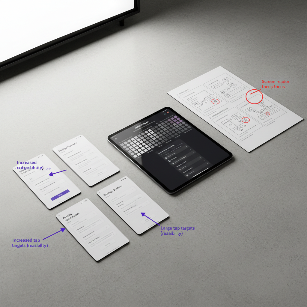
Proposed Improvements
Information Architecture
Reorganise programmes into clearer categories based on user goals rather than institutional structures.
Users should understand where to begin without needing prior knowledge of Hyper Island’s terminology.
[Image Placeholder: Revised information architecture]
Navigation
Reduce navigation complexity and make primary pathways more visible.
Users should be able to identify relevant content with fewer decisions.
[Image Placeholder: Navigation wireframe]
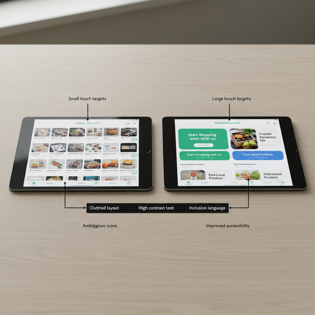
Readability & Accessibility
Improve:
- contrast
- spacing
- typography
- content chunking
- page hierarchy
The objective is to make information easier to scan and understand.
[Image Placeholder: Accessibility improvements wireframe]
Calls-to-Action
Clarify progression by reducing competing actions and making next steps more predictable.
Users should always understand what to do next.
[Image Placeholder: CTA redesign]
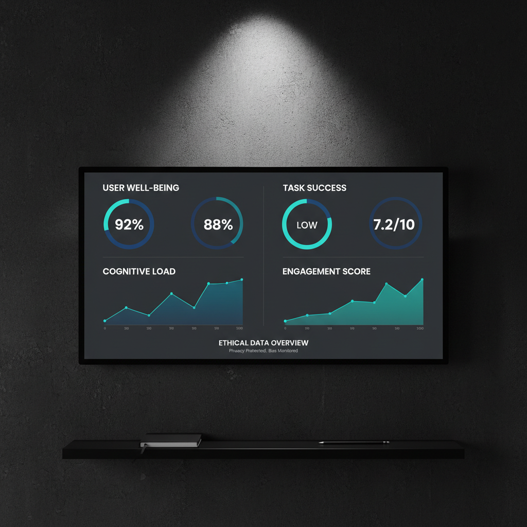
Success Metrics
What would indicate improvement?
The project proposes to measure:
- time to find a relevant programme
- clicks required to reach programme pages
- bounce rate on course pages
- progression to application pages
These metrics connect accessibility improvements directly to user outcomes and business goals.
[Image Placeholder: Metrics framework]
Reflection
This project reinforced an important lesson:
Accessibility is often treated as a technical checklist, but many accessibility barriers begin much earlier in the experience.
When information structures are unclear, users spend cognitive energy understanding the interface rather than making decisions.
Improving accessibility is therefore not only about compliance. It is about creating systems that help people understand where they are, what their options are, and what to do next.
 Katze Designs