Leo’s Lekland – Making inclusion visible in a family experience
An ethics and accessibility audit of Leo’s Lekland, examining how representation, accessibility information, and WCAG compliance affect both user experience and business outcomes.
Accessibility • Ethics • Research • Strategy

The Challenge
Leo’s Lekland is one of the largest indoor playground operators in the Nordics. Its website serves as an information hub, booking platform, and marketing channel for families.
The project explored a simple question:
Who might be excluded from the experience, intentionally or unintentionally?
The goal was to evaluate the website from both an accessibility and inclusion perspective, identifying gaps that could affect users, trust, and compliance.
Approach
Evaluating Accessibility and Inclusion
The review combined two perspectives:
- DEI (Diversity, Equity & Inclusion) audit
- WCAG accessibility review
The analysis focused on:
technical accessibility compliance
representation in imagery
inclusive language
accessibility information
feedback mechanisms
recruitment language
Key Findings
1
Accessibility information is difficult to find
Visitors with disabilities or accessibility needs receive very little information about physical access, support services, or facility limitations.
Without this information, families may be unable to determine whether a visit is suitable.
2
Disability representation is missing
The website presents families in a positive and diverse way, but children and adults with visible disabilities are absent from imagery and content.
Representation influences whether users feel acknowledged and included.
3
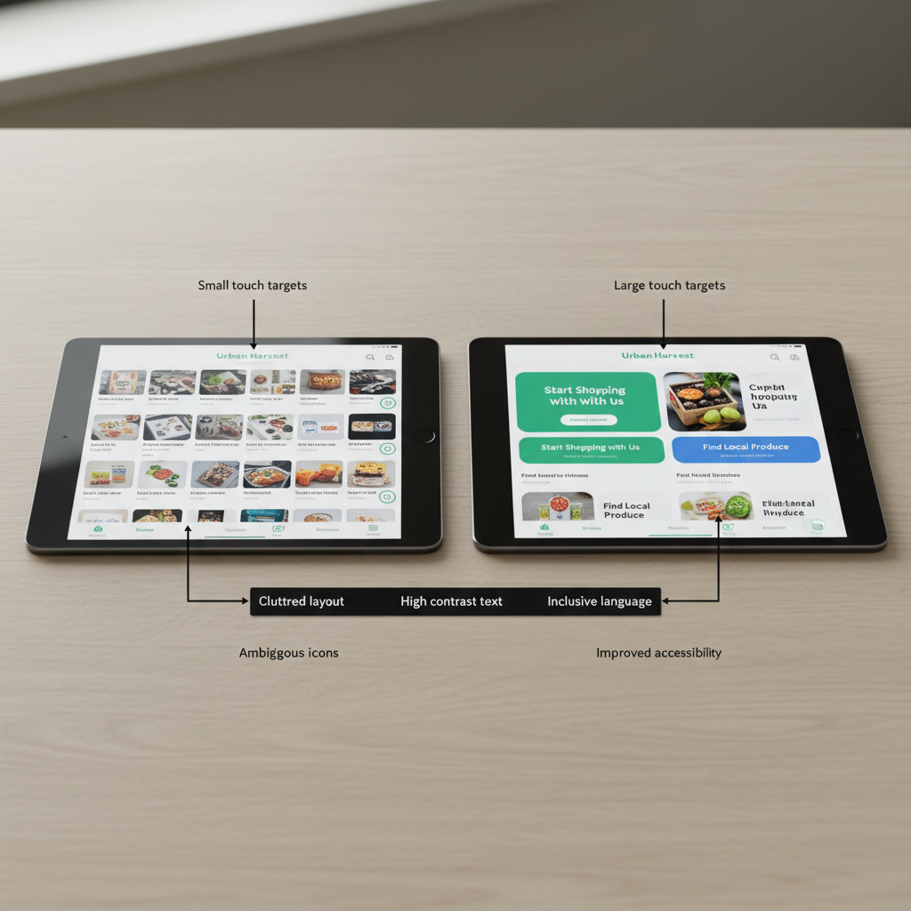
Accessibility issues create barriers
The audit identified 14 accessibility issues across areas such as:
- colour contrast
- heading hierarchy
- landmarks
- skip navigation
- focus states
Several findings create risks for both usability and WCAG compliance.
4
Feedback is largely one-way
Support channels exist, but there is limited opportunity for structured customer feedback, reviews, or transparency around user experiences.
This reduces opportunities for learning and trust-building.
Recommendations
Inclusive Representation
Introduce imagery that reflects a wider range of families, including:
- children with disabilities
- caregivers using mobility aids
- grandparents and extended family members
The objective is not token representation, but helping more visitors recognise themselves in the experience.
Accessibility Transparency
Create a dedicated accessibility section covering:
- wheelchair access
- sensory considerations
- available support
- facility limitations
Clear information reduces uncertainty before booking.
WCAG Improvements
Priority recommendations included:
- improving colour contrast
- fixing heading structure
- implementing skip links
- strengthening keyboard navigation
- improving alternative text
These changes improve usability for all visitors while supporting compliance.
Feedback & Accountability
Introduce visible feedback mechanisms such as:
- post-visit surveys
- customer review sections
- accessibility feedback channels
This creates a clearer loop between customer experience and service improvement.
Business Perspective
Why this matters
Accessibility and inclusion are often discussed as ethical responsibilities, but they are also business decisions.
The recommendations aimed to:
- reduce legal risk
- increase trust
- improve customer confidence
- support broader audience reach
- strengthen brand reputation
Inclusion becomes more meaningful when it is built into everyday decision-making rather than treated as a separate initiative.
Reflection
This project changed how I think about accessibility.
Many accessibility discussions focus on technical compliance, but the work highlighted a broader question: what information, assumptions, or design decisions unintentionally exclude people?
The most valuable insight was that inclusion is not only about meeting standards. It is about reducing uncertainty and helping people understand whether a product, service, or experience is genuinely designed for them.
