
Skanska Bostad – Reframing the Housing Search Experience
Designing a guided housing experience focused on everyday life, long-term clarity, and decision confidence.
UX Research · Behavioural Analysis · Information Architecture · Wireframing & Prototyping · UX Strategy

Context
This project explored how users experience the housing search journey on Skanska Bostad, with a particular focus on how people evaluate homes during major life transitions.
Through interviews, behavioural observation, competitor analysis, and prototype testing, the project investigated where users feel overwhelmed, unsupported, or uncertain during the decision-making process.
The research revealed a recurring mismatch between how people actually make housing decisions and how housing platforms typically present homes.
Users were not only comparing square meters and pricing. They were trying to understand what everyday life would realistically feel like after the move.
The project resulted in a concept called Everyday Fit – a guided housing experience designed to help users compare homes around practical lifestyle needs, long-term realities, and future living priorities rather than specifications alone.
[Insert supporting image: research board, prototype overview, or presentation slide]
Process
User Research & Behavioural Observation
The project began with qualitative interviews and observational analysis focused on how people currently search for homes online.
Research explored:
- housing search behaviour
- emotional and practical decision-making
- trust and transparency
- information overload
- lifestyle evaluation
- long-term financial considerations
Participants consistently described current housing platforms as difficult to interpret, overly polished, and heavily dependent on the user doing the comparison work themselves.
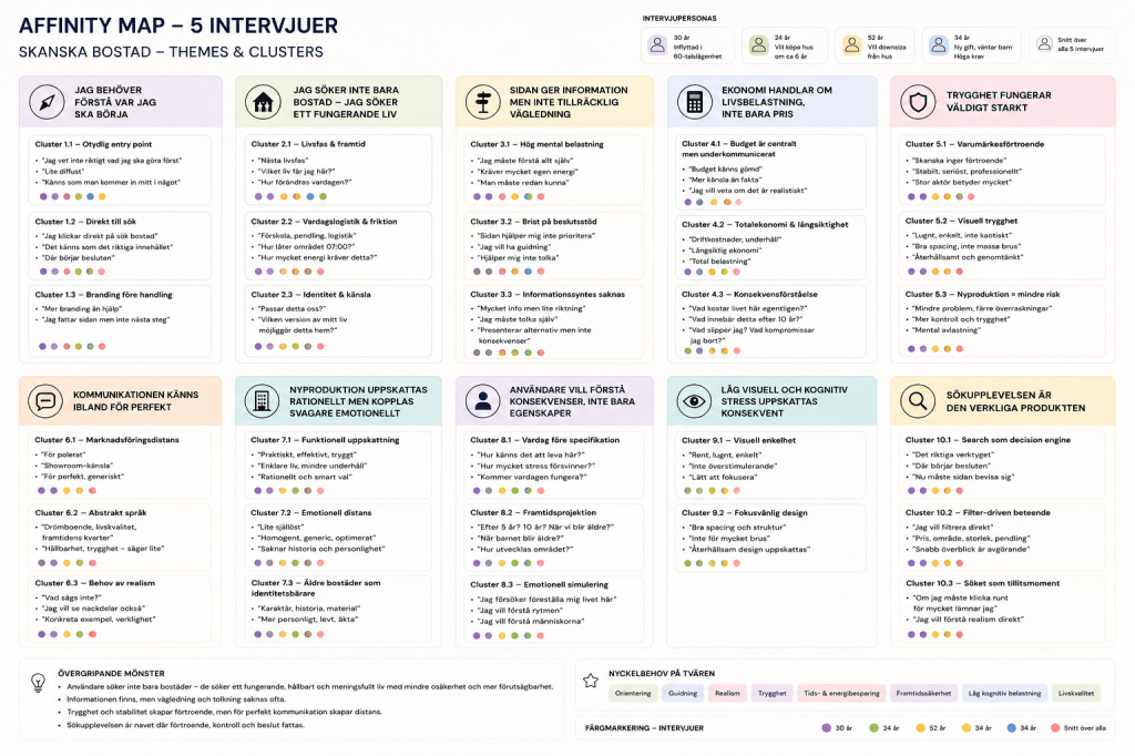
Users described housing search as mentally demanding and difficult to translate into real-life consequences.
Pattern Identification & Insight Synthesis
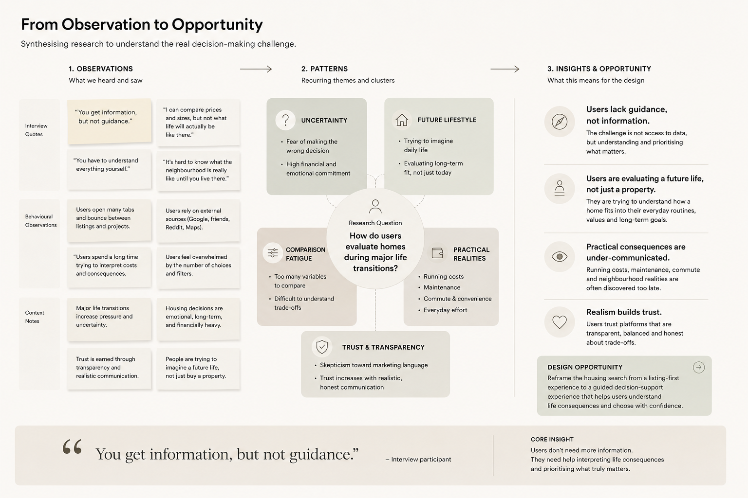
Interview findings and behavioural observations were clustered into recurring themes to identify broader experience-level patterns.
Several key insights emerged repeatedly:
- users lacked guidance rather than information
- practical realities felt under-communicated
- listings focused heavily on specifications
- users wanted help understanding long-term life consequences
- trust increased when communication felt realistic rather than aspirational
The strongest recurring pattern was that users were evaluating future lifestyle and daily routines, while platforms primarily presented properties as products.
Defining the Design Opportunity
The project reframed the housing search experience from a listing-first model into a guidance-oriented decision support experience.
Rather than asking:
“What property do you want?”
The concept explored:
“What kind of everyday life are you trying to create?”
This became the foundation for the design direction and prototype concept.
Insight
Users Needed Help Interpreting Life Consequences – Not Just Comparing Listings
Research Findings
“You get information, but not guidance.”
“I can compare prices and sizes, but not what life will actually be like there.”
“You have to understand everything yourself.”
Users were not lacking housing information.
They were lacking orientation, interpretation, and practical decision support.
Many participants described housing decisions as emotionally and mentally demanding because current platforms rarely help users connect listings to long-term lifestyle realities.
Design direction
Design Direction
The concept focused on:
- reducing cognitive overload
- increasing transparency
- introducing guided prioritisation
- helping users evaluate practical everyday fit
- reframing housing search around life context rather than only specifications
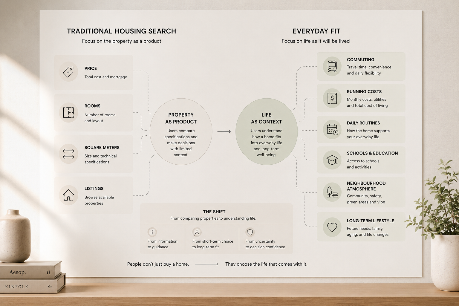
[Insert supporting diagram: traditional housing search vs guided housing discovery]
Concept Development
Everyday Fit
Everyday Fit is a guided housing experience designed to help users evaluate homes around real-life priorities and long-term practical realities.
Instead of filtering only by:
- price
- rooms
- square meters
the system introduces additional decision-support layers such as:
- running costs
- maintenance expectations
- neighbourhood context
- practical convenience
- lifestyle priorities
- long-term effort required
The concept was intentionally designed to feel calm, realistic, and trustworthy rather than overly personalised or sales-driven.
[Insert concept diagram or prototype overview]
Caption example:
The concept reframes housing search from specification browsing into guided life-fit comparison.
Wireframes & UX Direction
Low-fidelity wireframes were developed to test the structure and clarity of the guided experience.
The wireframes focused on:
- reducing visual overload
- progressive information disclosure
- guided prioritisation
- comparison clarity
- mobile-first usability
- realistic presentation of housing consequences
The mid-fidelity interface intentionally avoided high-pressure real estate aesthetics in favour of a calmer and more grounded visual tone.
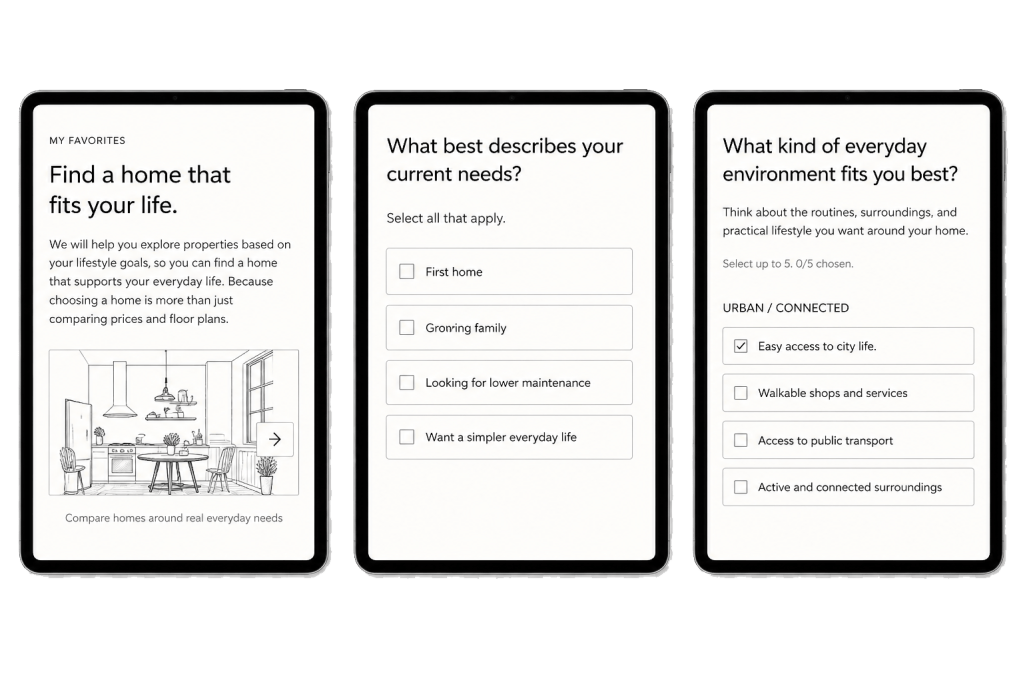
Wireframes focused on orientation, trust, and reduced cognitive load.
Design Decisions
1
Orientation Before Exploration
Most housing platforms immediately present users with large volumes of listings, filters, and specifications. Our research suggested that many users had not yet clarified what they were actually looking for.
The experience was therefore designed to create orientation before exploration.
Rather than asking users to browse hundreds of properties, the experience first helps them reflect on priorities, everyday needs, and practical trade-offs. This reduces early overwhelm and creates a clearer foundation for decision-making.
2
Practical Transparency
Participants repeatedly described uncertainty around the realities of living in a new home.
While information existed, users often struggled to interpret what it meant for everyday life.
To improve confidence, the concept introduced clearer visibility of:
- running costs
- maintenance expectations
- commuting realities
- neighbourhood amenities
- long-term practical implications
The goal was not to add more information, but to make important information easier to understand.
3
Guided Prioritisation
Many participants described housing search as mentally demanding because they had to structure and compare information themselves.
The concept introduces lightweight guidance that helps users identify what matters most before evaluating properties.
Rather than relying on endless filter combinations, users are guided through a series of practical priorities related to lifestyle, convenience, family needs, finances, and future plans.
This reduces complexity and supports more confident decision-making.
4
Lifestyle Preview
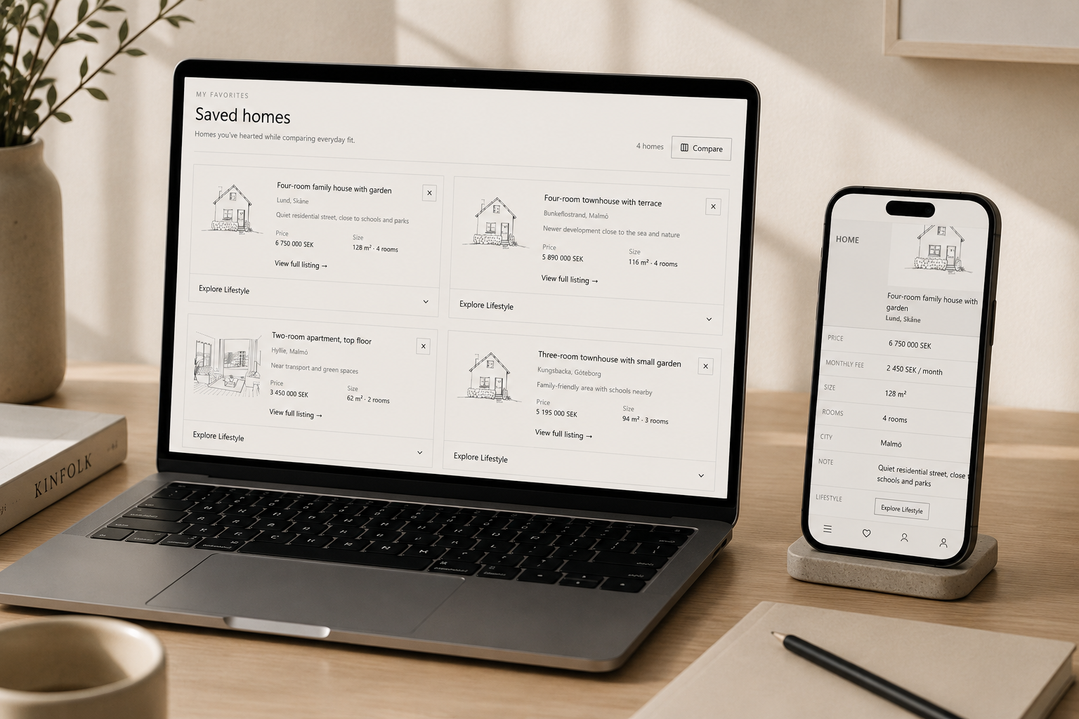
To help users understand life beyond the property itself, the concept introduced a Lifestyle Preview feature.
Users can explore neighbourhood atmosphere, local services, public transport, schools, commuting, and everyday convenience through interactive maps, resident stories, and a Take a Tour video section.
The goal is to help users evaluate not just a home, but the life that comes with it.
- resident stories and lifestyle testimonials
- neighbourhood overviews
- interactive maps
- local amenities and services
- public transport accessibility
- commuting context
- nearby schools and activities
- social atmosphere and community indicators
Solution
Everyday Fit
The final concept reframes housing search from property comparison to decision support.
Research showed that users were not struggling because of a lack of information. They were struggling because they lacked guidance.
Current housing platforms are effective at presenting listings, specifications, and imagery. However, much of the interpretation work remains with the user.
Everyday Fit introduces a more structured approach by helping users:
- clarify priorities
- understand trade-offs
- compare practical realities
- explore neighbourhood context
- evaluate long-term suitability
The result is a calmer and more supportive experience designed to reduce friction and increase confidence throughout the housing journey.
Impact
While the concept was exploratory, prototype testing produced strong signals.
Participants consistently described the experience as:
- easier to navigate
- more trustworthy
- more realistic
- less overwhelming
- more relevant to how they actually evaluate homes
Several participants highlighted the match score, neighbourhood information, running costs, and lifestyle context as particularly valuable.
One participant summarised the experience:
“It made me feel understood.”
Another explained:
“It removes distrust and skepticism towards the housing market.”
The strongest outcome was not improved efficiency alone. It was improved confidence.
Users felt better equipped to understand their options and make informed decisions.
Reflection
This project reinforced how deeply human housing decisions are.
While most property platforms optimise around listings and specifications, users were often thinking in terms of stress, routines, lifestyle changes, and future consequences.
The research showed that people rarely struggle because of lack of information alone. More often, they struggle because they are left to interpret complex decisions entirely by themselves.
The project also highlighted the importance of restraint in UX design. Rather than building a heavily personalised or overly technical system, the strongest direction became creating a calmer and more transparent experience that supports clearer thinking.
More broadly, the project strengthened my understanding of how UX can function not only as interface design, but as practical decision support during high-stakes life choices.

