Gymgrossisten — Translating Customer Feedback into UX Improvements
Using behavioural data, customer feedback, and checkout analysis to identify friction points and redesign critical purchase flows.
UX Design · Data Analytics & UX Optimisation · Symplify · Wireframing & Prototyping

Context
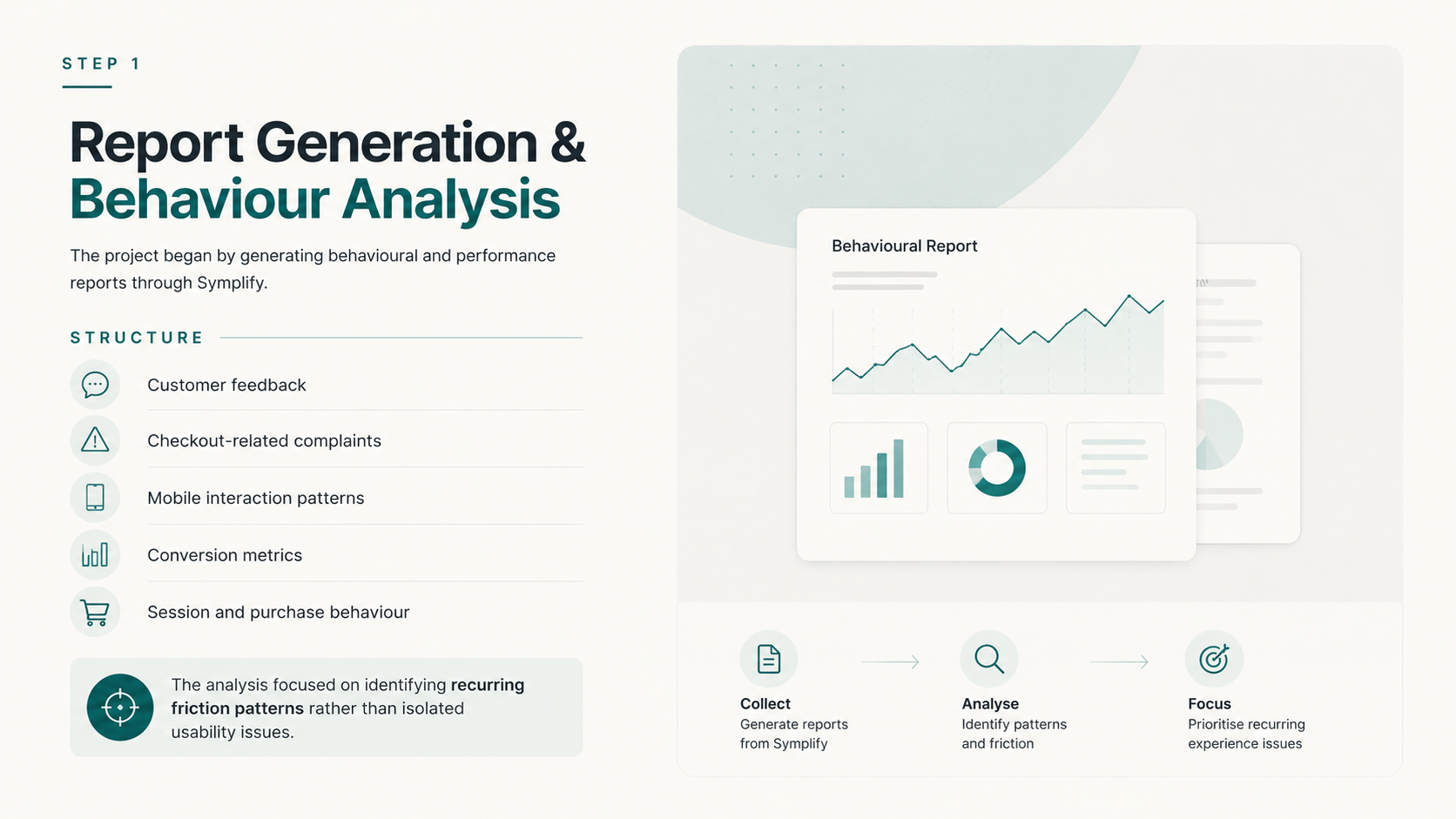
This project explored how qualitative customer feedback and behavioural analytics can be translated into actionable UX improvements within an e-commerce environment.
Using customer support data, behavioural reports, and conversion analysis from Symplify, the goal was to identify where users experience friction during the purchasing journey and redesign key interactions to improve clarity, trust, and completion rates.
The focus was placed on mobile checkout behaviour, promotional friction, and moments where users abandoned purchases due to confusion or system instability.
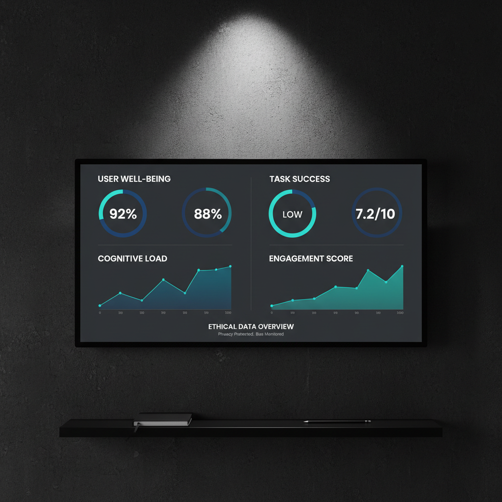
[Insert supporting image: dashboard screenshot, analytics export, or checkout interface]
Process
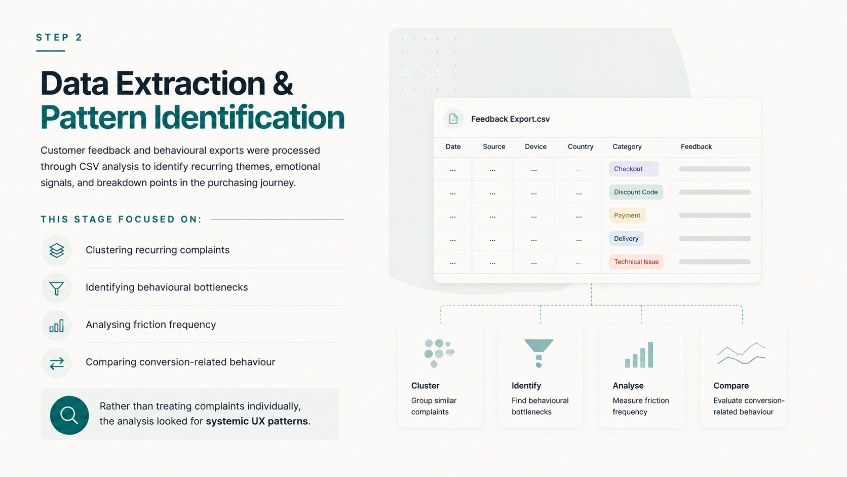
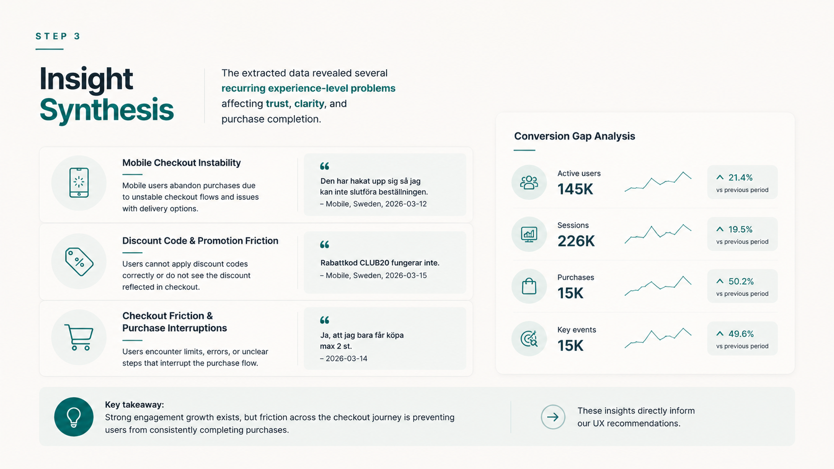
Insight Synthesis
The extracted data revealed several recurring experience-level problems affecting trust, clarity, and purchase completion.
Mobile Checkout Instability
Data
“Den har hakat upp sig så jag kan inte slutföra beställningen”
Mobile, Sweden, 2026-03-12
“Det går inte att ändra avhämtningen så jag handlar produkterna på Apohem denna gång!”
Mobile, Sweden, 2026-03-23
Insight
Mobile users abandon purchases when checkout flows feel unstable, unclear, or technically unreliable.
Users experienced uncertainty around loading states, delivery options, and whether actions had been successfully completed.
UX Recommendation
- Introduce loading and progress indicators
- Improve visibility of checkout status
- Display clear error messaging
- Ensure responsive behaviour across screen sizes
[Insert graph: mobile checkout abandonment or error frequency]
Discount Code & Promotion Friction
Data
“Rabattkod CLUB20 fungerar inte.”
Mobile, Sweden, 2026-03-15
“Det blev ingen skillnad på slutsumman när jag la in CLUB20”
Mobile, Sweden, 2026-03-15
Insight
Users lose trust when discounts fail silently or when price adjustments are unclear during checkout.
The issue was not only technical, but communicative. Users lacked confirmation, transparency, and feedback.
UX Recommendation
- Confirm when discounts are successfully applied
- Show updated totals immediately
- Display contextual error messaging
- Improve visibility of promotional logic
[Insert graph: promotion-related complaints or failed discount interactions]
Checkout Friction & Purchase Interruptions
Data
“Ja, att jag bara får köpa max 2 st”
2026-03-14
“Obetalda fakturor…”
2026-03-16
Insight
Checkout interruptions create frustration when users encounter restrictions or unclear purchasing limitations without sufficient explanation.
Users expected smooth progression, but experienced sudden obstacles and unclear constraints.
UX Recommendation
- Surface purchasing limits earlier
- Improve cart visibility and feedback
- Create smoother step transitions
- Clarify blocked actions and payment states
[Insert graph: checkout exits, failed sessions, or friction frequency]
Conversion Gap Analysis
Data
- Active users: 145K (+21.4%)
- Sessions: 226K (+19.5%)
- Purchases: 15K (+50.2%)
- Key events: 15K (+49.6%)
Insight
The platform demonstrated strong growth and purchasing intent, but the experience did not consistently guide users toward conversion.
Some users converted efficiently, while others struggled to orient themselves within the purchase flow.
UX Recommendation
- Reduce early decision friction
- Make the primary action immediately visible
- Introduce stronger onboarding hierarchy
- Guide users toward high-confidence starting points
[Insert graph: conversion funnel or sessions-to-purchase comparison]
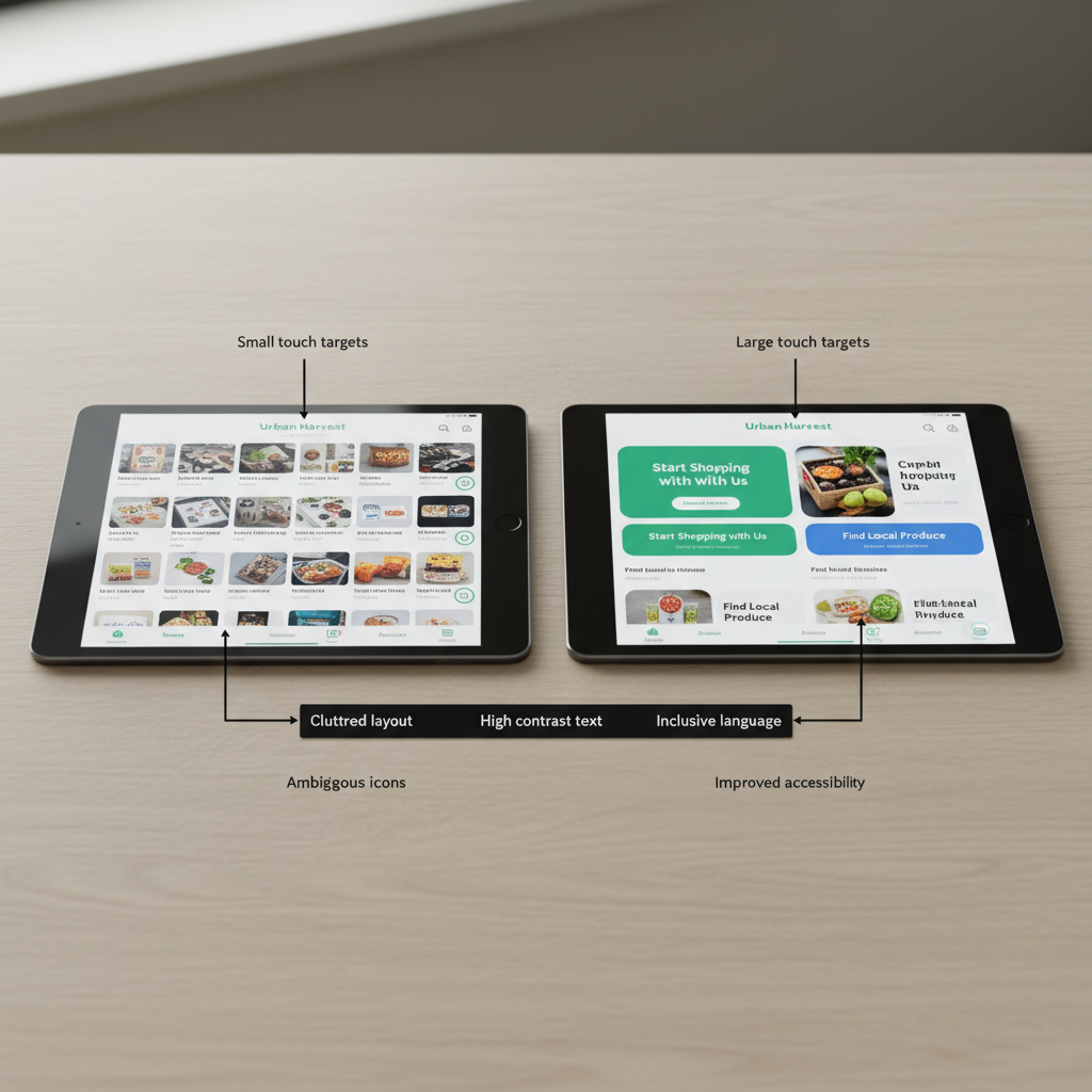
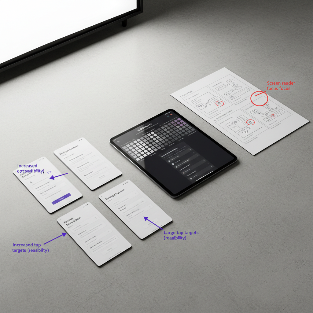
Wireflow & UX Direction
Based on the identified friction patterns, redesigned wireflows were created to improve orientation, reduce cognitive load, and strengthen checkout confidence.
The redesigned flows focused on:
- clearer progression
- visible feedback
- simplified decision-making
- improved mobile responsiveness
[Insert wireflow]
Caption example:
Wireflow redesign focused on reducing friction across mobile checkout interactions.
Design Decisions
Structure
The checkout flow was simplified into clearer sequential steps to reduce uncertainty during purchase completion.
Priority actions and system feedback were surfaced more visibly to support user orientation.
Accessibility
Touch interactions, responsive spacing, and simplified messaging were prioritised to improve usability across mobile devices.
Error states and status changes were designed to remain visible and understandable without requiring technical interpretation.
Behavioural Clarity
Rather than adding additional functionality, the redesign focused on reducing ambiguity during high-friction moments.
System feedback, pricing changes, and purchasing restrictions were surfaced more proactively to strengthen trust.
[Insert final prototype screens]
Caption example:
Responsive checkout flow designed around visibility, reassurance, and reduced friction.
Caption example:
Improved promotional feedback designed to increase transparency during purchase decisions.
Solution
The final concept reframes checkout not as a transactional endpoint, but as a guided and confidence-building interaction.
By translating behavioural data into experience-level insights, the redesign focused on improving trust, clarity, and progression throughout the purchasing journey.
The project demonstrates how data analysis and UX thinking can work together to identify friction patterns and create more intuitive e-commerce experiences.
Reflection
This project reinforced the value of combining behavioural analytics with UX analysis to uncover deeper experience-level problems.
Many of the identified issues were not caused solely by functionality failures, but by uncertainty, unclear communication, and loss of trust during critical purchase moments.
The process also highlighted how qualitative feedback can reveal emotional friction that quantitative metrics alone may overlook. Translating customer complaints into UX patterns made it possible to move beyond isolated issues and identify broader structural improvements across the checkout experience.
More broadly, the project strengthened my understanding of how data-informed UX can support clearer decision-making, stronger user confidence, and more resilient digital commerce experiences.
