GYST — Redesigning Analytics Dashboards as a Confidence Experience
Exploring how onboarding, conversational guidance, and insight-led UX can transform complex analytics into a clearer, more empowering experience for creators.
UX Design · Live Client Proposal · Research, Mapping & Prototyping · Lovable

Context
GYST is an AI-powered analytics platform designed for elite content creators and teams managing multi-platform revenue, audience, and performance data.
While the platform provides access to powerful insights, the existing experience relies heavily on conventional dashboard patterns built for analytical users rather than creators.
The challenge was not simply presenting information, but helping users feel capable, oriented, and confident while navigating complexity.
This matters because users making high-stakes business decisions often disengage when systems feel cognitively demanding, overly technical, or emotionally unrewarding.
[Insert supporting image: current dashboard, onboarding screen, or concept visual]
Problem Reframing
What We Observed
Analysis of the brief, onboarding experience, personas, and existing platform revealed a recurring tension:
Users are expected to make confident business decisions, yet the interface assumes a level of analytical comfort many creators do not have.
The result is access to data without clarity or confidence.
The Core Problem
The challenge is not a lack of information.
The challenge is that analytics experiences often:
- overwhelm users cognitively
- prioritise raw data over meaning
- rely on corporate dashboard conventions
- demand interpretation skills users are not meant to have
As a result, users hesitate, disengage, or default to intuition instead of informed decision-making
UX Direction
The experience was reframed around one central shift:
From data platform → insight partner
Rather than exposing everything at once, the design direction focused on:
- reducing intimidation
- progressively revealing complexity
- helping users understand what matters
- making analytics feel supportive rather than technical
The intended emotional shift was:
overwhelmed → capable
Research & Experience Analysis
Research focused on how users emotionally and cognitively experience onboarding, setup, and first interaction with business analytics.
Methods included:
- onboarding walkthroughs with client
- first-time platform exploration
- team synthesis sessions
- behavioural observation
- UX mapping
Users lose confidence early
The onboarding experience asks users for effort and trust before clearly communicating value.
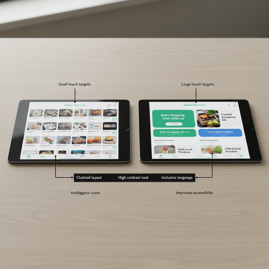
Existing dashboards feel corporate and intimidating
Dense layouts, statistics, and competing information created hesitation rather than curiosity.
Users want guidance, not more data
Participants responded more positively to conversational explanations and prioritised insights than raw analytics.
The AI companion lacks clarity
Users often did not understand what the AI could do, and to prompt effectively, when to interact with it, or why it mattered.
Small confirmation ques improve engagement
Moments of visible progress and early insight increased motivation during setup.
[Insert research image, onboarding analysis, or synthesis board]
Flows
Mapping exercises were used to understand emotional states, decision points, and moments of hesitation throughout the bridal journey.
1
User journey map (jump down link)
Rather than isolating onboarding as a single task, the full experience was mapped from first interaction through first meaningful insight.
The map focused on:
- emotional shifts
- moments of confusion breakdowns in confidence
- friction between user expectations and system behaviour
2
Storyboard
The storyboard explored how the redesigned experience should feel emotionally and behaviourally.
The intention was to:
- reduce intimidation
- create earlier moments of clarity
- introduce guidance progressively
- make interaction feel motivating rather than demanding
3
User flow
The redesigned flow translated research insights into clearer onboarding and dashboard interactions.
The structure focused on:
- reducing unnecessary decisions
- simplifying navigation
- prioritizing insights based on user business needs
- making options for dashboard viewing
4
Prototype Strategy
The prototype focused on four key implementations designed to support clarity, confidence, and long-term engagement.
Rather than redesigning isolated screens, the work centred on critical moments where users lose understanding or motivation.
Implementation
Insight-first onboarding
The onboarding experience introduces the value of GYST before exposing dashboards or metrics.
Users are guided through what the platform does, why it matters, and how it supports their goals.
This reframes analytics as insight and direction rather than information overload.
[Insert onboarding screens]
Caption example:
Onboarding designed to create understanding before asking for effort.
Guided account connection
Platform setup was redesigned to feel shorter, clearer, and more rewarding.
Progress indicators, adaptive guidance, and early insight previews reduce friction during onboarding.
[Insert setup flow]
Caption example:
Connection flow focused on momentum, visibility, and reduced cognitive load.
Personalised first dashboard
The dashboard prioritises one meaningful insight instead of displaying all available data simultaneously.
Secondary information remains accessible, but complexity is progressively revealed.
[Insert dashboard screens]
Caption example:
Dashboard hierarchy designed around prioritisation rather than density.
AI companion as guide
The AI companion was repositioned as a translator and strategic guide rather than a passive feature.
Suggested prompts and conversational support reduce uncertainty around interaction.
[Insert AI interaction screens]
Caption example:
AI guidance designed to support interpretation and decision-making.
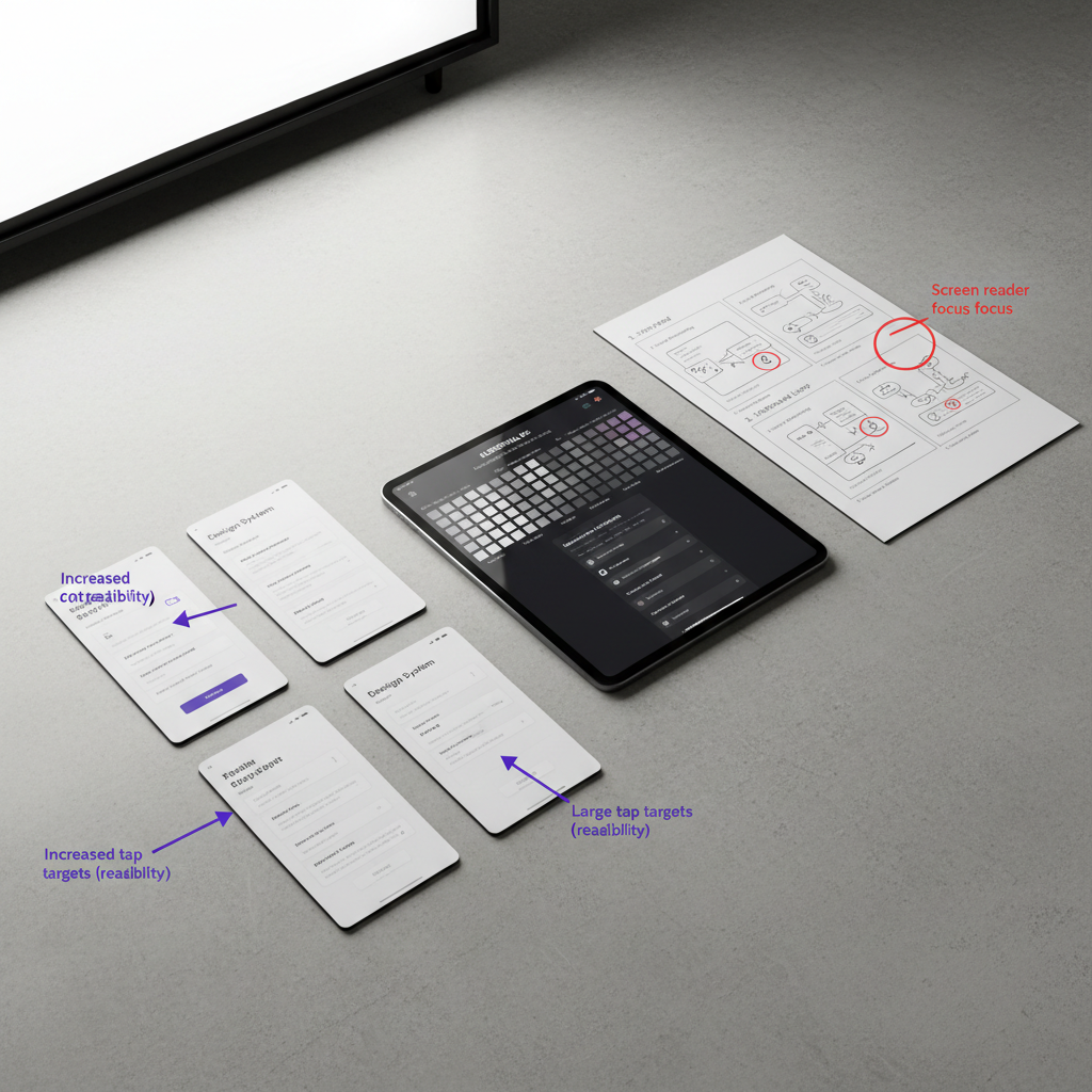
Design Decisions
Structure
The experience was designed around progressive disclosure, allowing users to engage with insights gradually rather than confronting dense analytics immediately.
Hierarchy prioritised meaning and orientation over feature exposure.
Accessibility
Simplified language, focused layouts, clear hierarchy, and conversational guidance reduced cognitive friction throughout onboarding and dashboard interactions.
Complex information was translated into more readable and actionable patterns.
Ethics
The design avoids pressure-driven engagement patterns, manipulative urgency, or artificial productivity signals.
Instead, the experience focuses on transparency, autonomy, and helping users build confidence in their own decision-making.
Visual Identity & UI Direction
The visual language was designed to feel sophisticated, intelligent, and approachable without adopting generic SaaS aesthetics.
The interface combines:
- deep teal and indigo tones for trust and sophistication
- cyan and yellow highlights for insight moments and interaction feedback
- clean typography and whitespace to reduce visual overload
The goal was to create a system that feels premium and technologically advanced while remaining emotionally supportive.
[Insert UI system, colour palette, typography, or component visuals]
Solution
The final concept reframes analytics as a guided, insight-led experience rather than a passive dashboard system.
By combining onboarding clarity, prioritised insights, conversational AI, and progressive disclosure, the platform supports users in feeling more capable when interacting with complex business information.
The experience is designed not only to present data, but to strengthen confidence, understanding, and engagement over time.
Captions:
Caption example:
Personalised insight cards designed to reduce overwhelm and support decision-making.
Caption example:
Conversational AI interactions positioned as guidance rather than technical support.
Reflection
This project reinforced how deeply emotional analytics experiences can be.
The core challenge was never the absence of data, but the gap between information and understanding. Mapping the onboarding journey revealed that moments of friction were often tied to uncertainty, intimidation, and loss of confidence rather than purely usability issues.
The process also highlighted the importance of reframing business goals into experience-level problems before moving into interface design. By grounding decisions in emotional and behavioural insights, the redesign could focus on clarity, guidance, and empowerment instead of simply reorganising features.
More broadly, the project strengthened my interest in systems that help users navigate complexity without feeling overwhelmed by it, and how UX can transform technically demanding products into experiences that feel human, supportive, and actionable.
