Sheer Bride™ — Guiding User Confidence Through Virtual Customisation
Exploring how digital personalisation, visual storytelling, and guided interaction can reduce uncertainty in the bridal shopping experience.
UX Design · Private Business · Lovable

Context
Traditional bridal shopping can feel emotionally overwhelming, time-consuming, and limiting. Many brides struggle to visualise how a dress will look, adapt designs to their preferences, or confidently make decisions without repeated fittings and appointments.
Existing online bridal experiences often rely on static galleries with limited personalisation and little emotional engagement.
This matters because bridal purchasing is deeply personal, emotional, and high-pressure. Uncertainty in the experience can reduce confidence and increase decision fatigue.
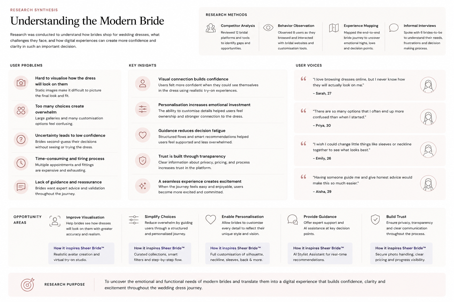
Research & Insights
Research explored how users emotionally navigate bridal shopping, customisation, and decision-making in digital environments.
Methods included:
- Competitor analysis
- Behaviour observation
- Experience mapping
Users struggle to visualise themselves in the product
Static product photography created distance between the user and the final outcome, making decision-making harder.
Personalisation increases emotional connection
Users responded positively when they could actively shape and customise the experience around their preferences.
Too many choices create overwhelm
Large galleries without guidance or structure made browsing feel exhausting rather than inspiring.
Emotional reassurance is part of the experience
Participants valued calm, guided interactions that reduced pressure and uncertainty during decision-making.
Visual interaction builds trust
Interactive previews and virtual try-on features helped users feel more confident in their choices.
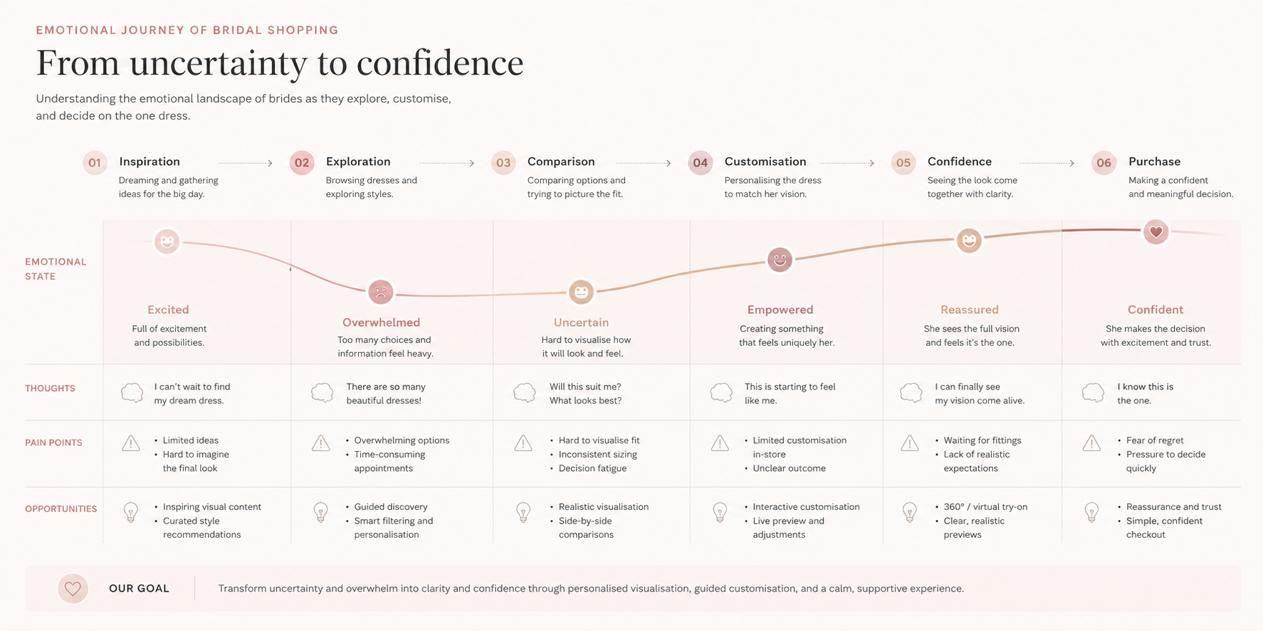
Flows
Mapping exercises were used to understand emotional states, decision points, and moments of hesitation throughout the bridal journey.
1
User journey map
Mapped the emotional progression from inspiration and browsing to dress customisation and purchase confidence.
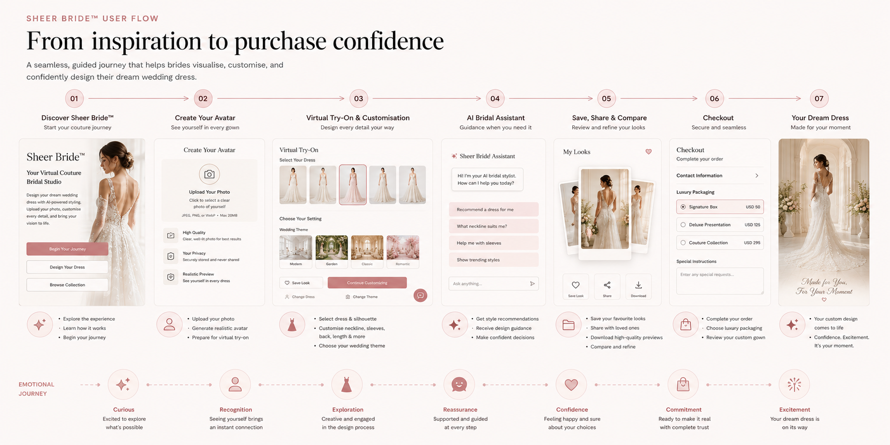
2
User flow
Created simplified flows for avatar creation, dress browsing, customisation, and checkout progression.
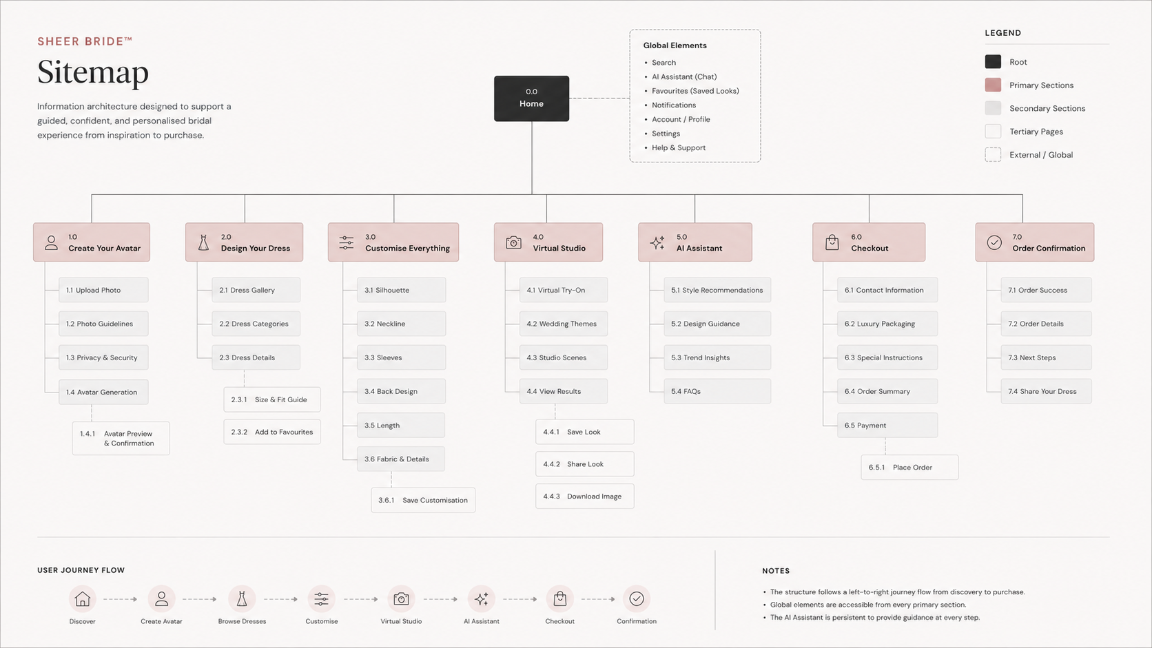
3
Site map
Created a detailed sitemap to define content hierarchy, navigation structure, and feature relationships, supporting a clear and scalable user experience across the platform.
4
Prototype
A clickable prototype was developed to explore how virtual interaction, guided personalisation, and visual clarity could support bridal decision-making.
Design Decisions
Structure
The interface was designed around progressive exploration, allowing users to move gradually from inspiration to detailed personalisation without cognitive overload.
Navigation prioritised clarity and emotional pacing rather than dense feature exposure.
Accessibility
Large visual hierarchy, readable typography, and simplified pathways were used to support clarity across emotionally high-stakes interactions.
Customisation tools were kept visually direct and easy to understand without technical language.
Ethics
The experience avoids urgency-driven purchasing patterns and overwhelming choice architecture.
Instead, the interface focuses on reassurance, autonomy, and helping users make decisions at their own pace.
Solution
The prototype focused on:
- avatar-based visualisation
- dress customisation
- guided navigation
- emotionally calm interaction patterns
The final concept combines virtual try-on, guided customisation, and emotionally-aware UX patterns to make bridal shopping feel more personal, calm, and interactive.
Rather than replicating a traditional e-commerce experience, the platform reframes bridal shopping as a guided and confidence-building journey.
Reflection
This project highlighted how emotional design extends beyond aesthetics into pacing, guidance, and interaction structure.
Research consistently showed that users were not simply searching for products, but for reassurance and confidence within an emotionally significant process.
The project also reinforced how digital experiences can support personal decision-making when interfaces prioritise clarity, emotional awareness, and user autonomy over feature density.
