NextUp Finance – Reducing uncertainty in financial decision-making
A research-led UX project exploring how clearer structure, behavioural insight, and future visualisation can help Gen Z users engage more confidently with financial planning.
Research Strategy · Design Thinking · UX Strategy · Prototype

Context
Many financial products assume users already understand budgeting, forecasting, and long-term planning.
For younger users, financial planning often feels abstract, emotionally distant, and difficult to act on. Existing interfaces rely heavily on numbers, financial terminology, and future-oriented thinking, which can create hesitation instead of engagement.
The challenge was not simply presenting financial information, but helping users understand what matters and feel capable of acting on it.
[Insert supporting image: existing finance app interface, research board, or conceptual finance visual]
Structured Observation
The project began with interviews and behavioural analysis focused on how Gen Z users relate to financial planning, uncertainty, and future decision-making.
The goal was to identify where understanding breaks down, what creates hesitation, and how financial systems become emotionally or cognitively difficult to engage with.
Methods included:
- Survey screeners
- Structured interviews
- Interview analysis and synthesis
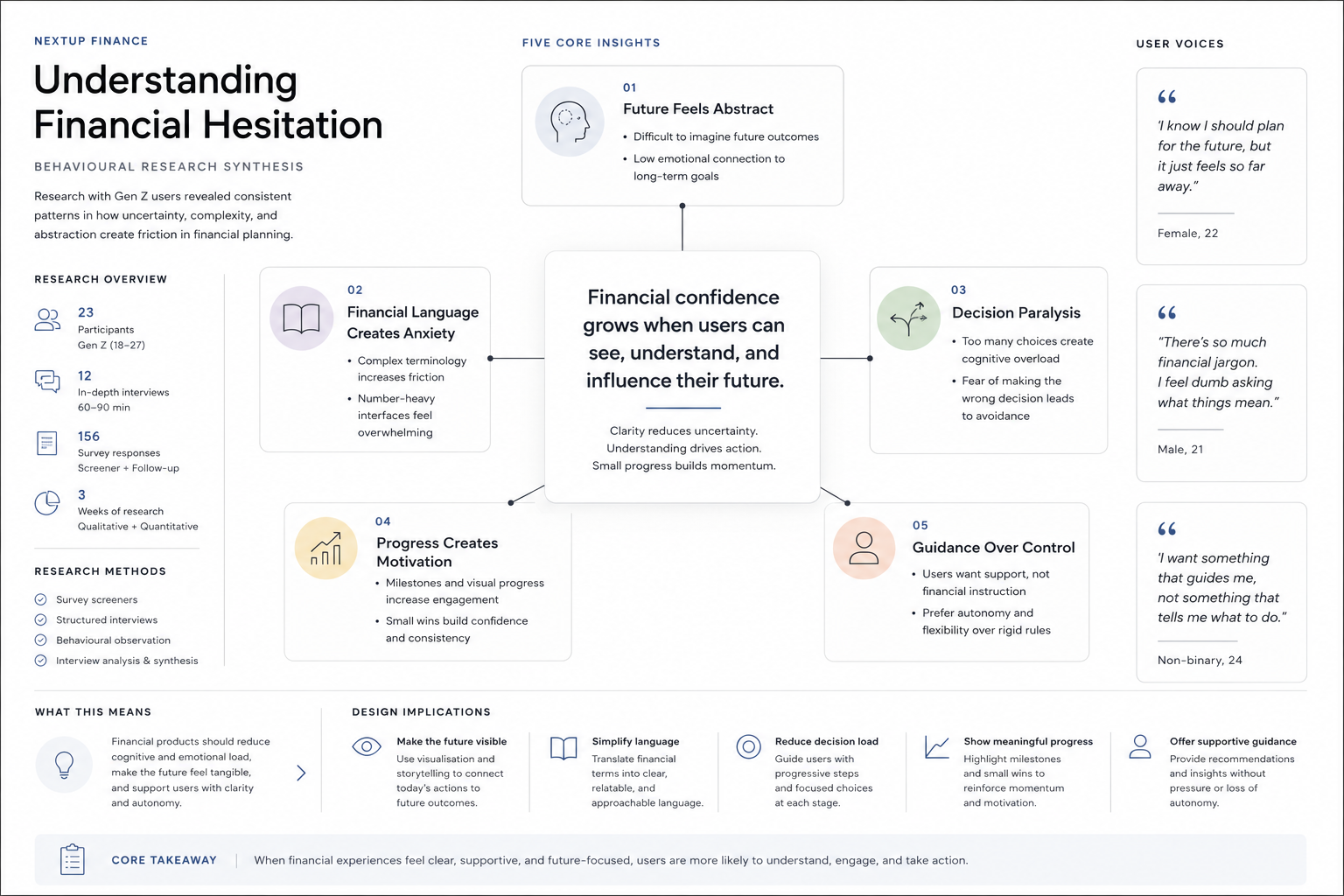
Users struggle to visualise their future
Many participants described financial planning as abstract and emotionally distant, making it difficult to stay motivated.
Financial language creates hesitation
Complex terminology and number-heavy interfaces increased anxiety and reduced engagement.
Users want guidance without feeling controlled
Participants preferred supportive structure over rigid financial instruction.
Progress increases motivation
Users responded positively to visible milestones, projections, and small indicators of advancement.
Clarity reduces emotional overload
Simple layouts and focused pathways helped users feel more confident when making decisions.
[Insert image: affinity mapping, quotes, or research synthesis]
Flows
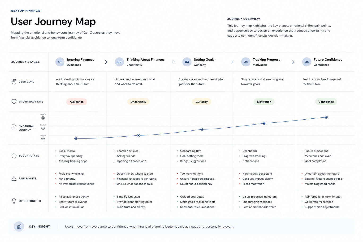
To better understand emotional and behavioural friction points, multiple UX mapping methods were used throughout the process.
1
User journey map (jump down link)
Mapped emotional states across the financial planning experience to identify moments of uncertainty, avoidance, and motivation.
2
Storyboard
Explored how financial stress and future uncertainty appear in everyday situations and decision-making.
3
User flow
Created simplified pathways for onboarding, financial goal setting, and future projection interactions.
4
Prototype
A clickable prototype was developed to test interaction patterns, visual hierarchy, and behavioural responses in a more realistic context.
Design Decisions
Structure
The interface was designed around progressive disclosure, reducing cognitive overload by presenting one primary action at a time.
Clear hierarchy and simplified navigation helped users focus on immediate decisions without losing long-term context.
Accessibility
High contrast, simplified language, and consistent spacing were used to improve readability and reduce friction.
Financial concepts were translated into more visual and approachable interactions to support cognitive clarity.
Ethics
The experience avoids pressure-based design patterns and fear-driven financial messaging.
Instead of manipulating urgency, the interface focuses on transparency, guidance, and user autonomy.
Solution
The prototype focused on:
- future finance projections
- goal progression
- simplified decision-making
- emotional clarity
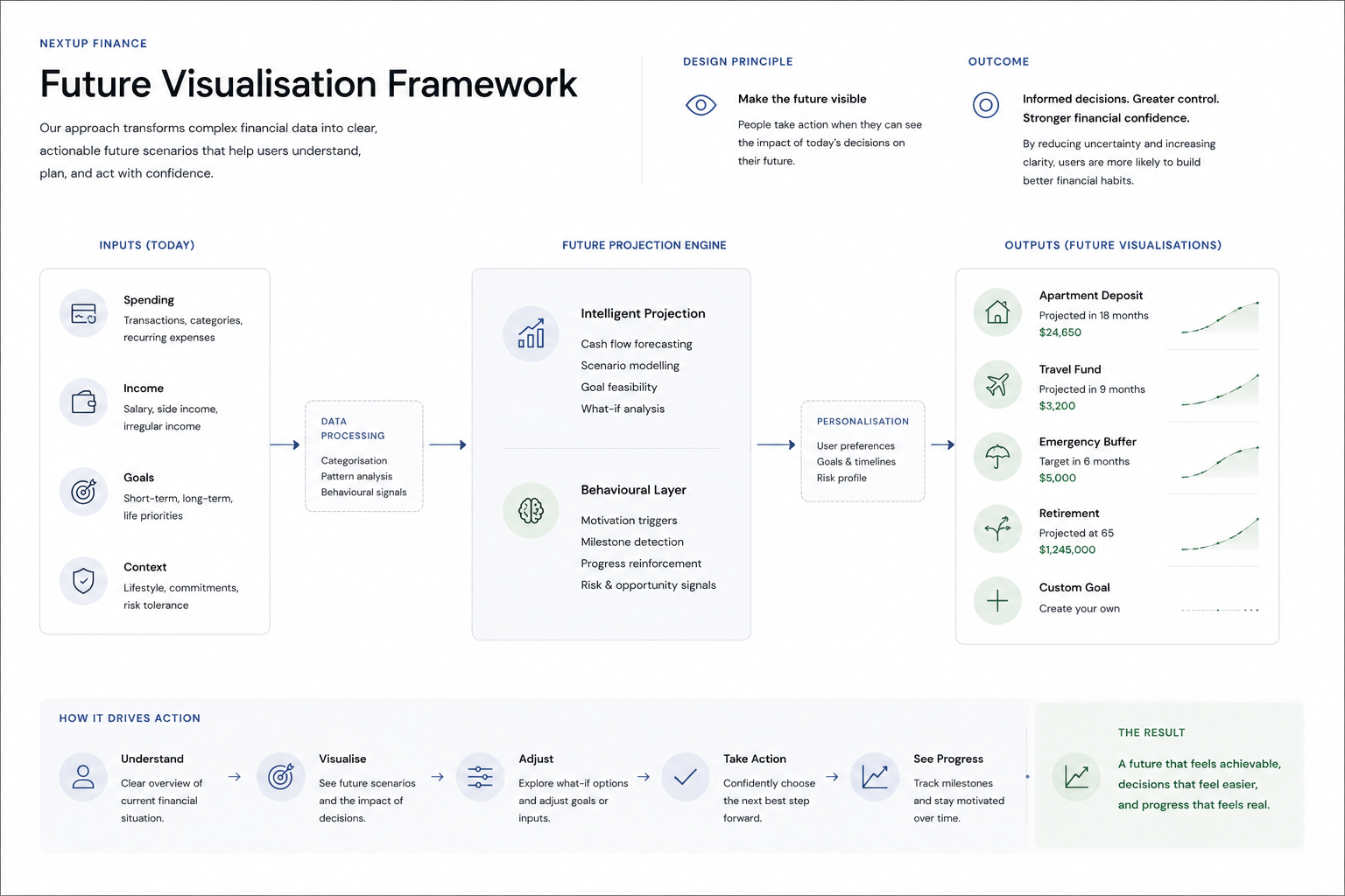
The final concept combines future visualisation with structured goal progression to make financial planning feel more tangible and manageable.
Rather than centring raw financial data, the experience centres understanding, orientation, and behavioural confidence.
Reflection
This project reinforced how strongly financial experiences are shaped by perception, not just information.
Early research showed that many users were not avoiding financial planning because of a lack of interest, but because existing systems felt abstract, overwhelming, and disconnected from their daily lives. Designing around “future blindness” shifted the focus from presenting data to creating orientation and clarity.
The process also highlighted the importance of translating research into structured design decisions. Frameworks such as Double Diamond, hypothesis-driven UX, and iterative testing helped ensure that each interaction served a defined behavioural outcome rather than adding unnecessary complexity.
More broadly, the project deepened my interest in systems that influence long-term decision-making, and how UX can reduce cognitive and perceptional friction in areas that directly affect people’s sense of stability and control.
