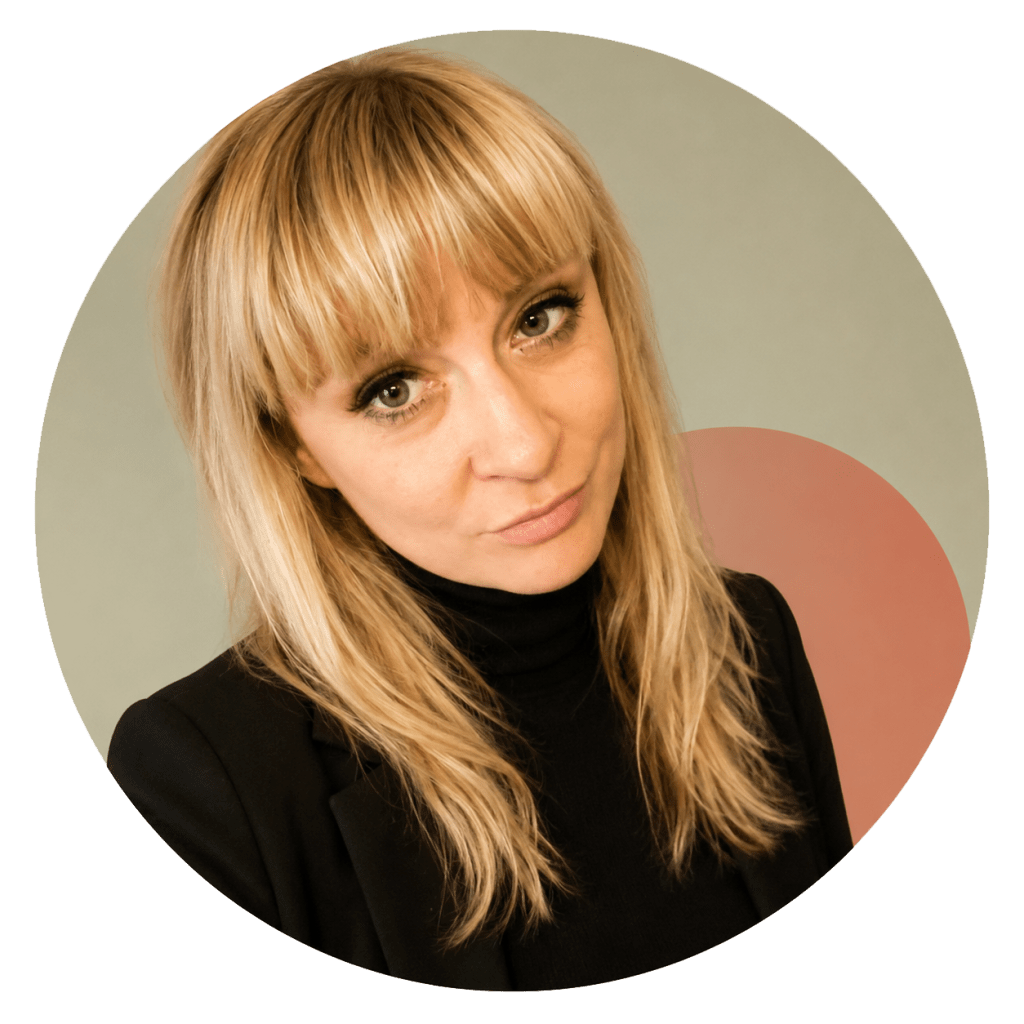
About
I started in fashion, studying in London and graduating in 2007. It shaped how I think about form, detail, and how people relate to what they use.
In 2014, I did my formal design studies specializing in design for sustainabilioty, focusing more on perception, expression, and long-term thinking.
I later worked as a fashion designer in South Africa, which grounded my work in real decisions, constraints, and client satisfaction.
In 2026, I completed my UX design studies. My work now centres on research, structure, and designing for clarity in complex systems.
I spend my time between Europe and Africa, working remotely and drawing from different contexts and ways of living.
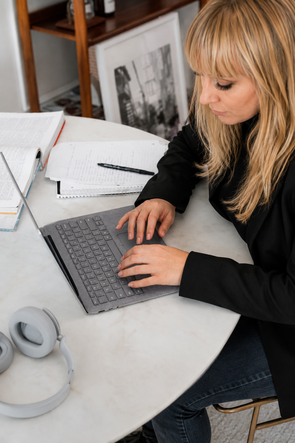
How I Design
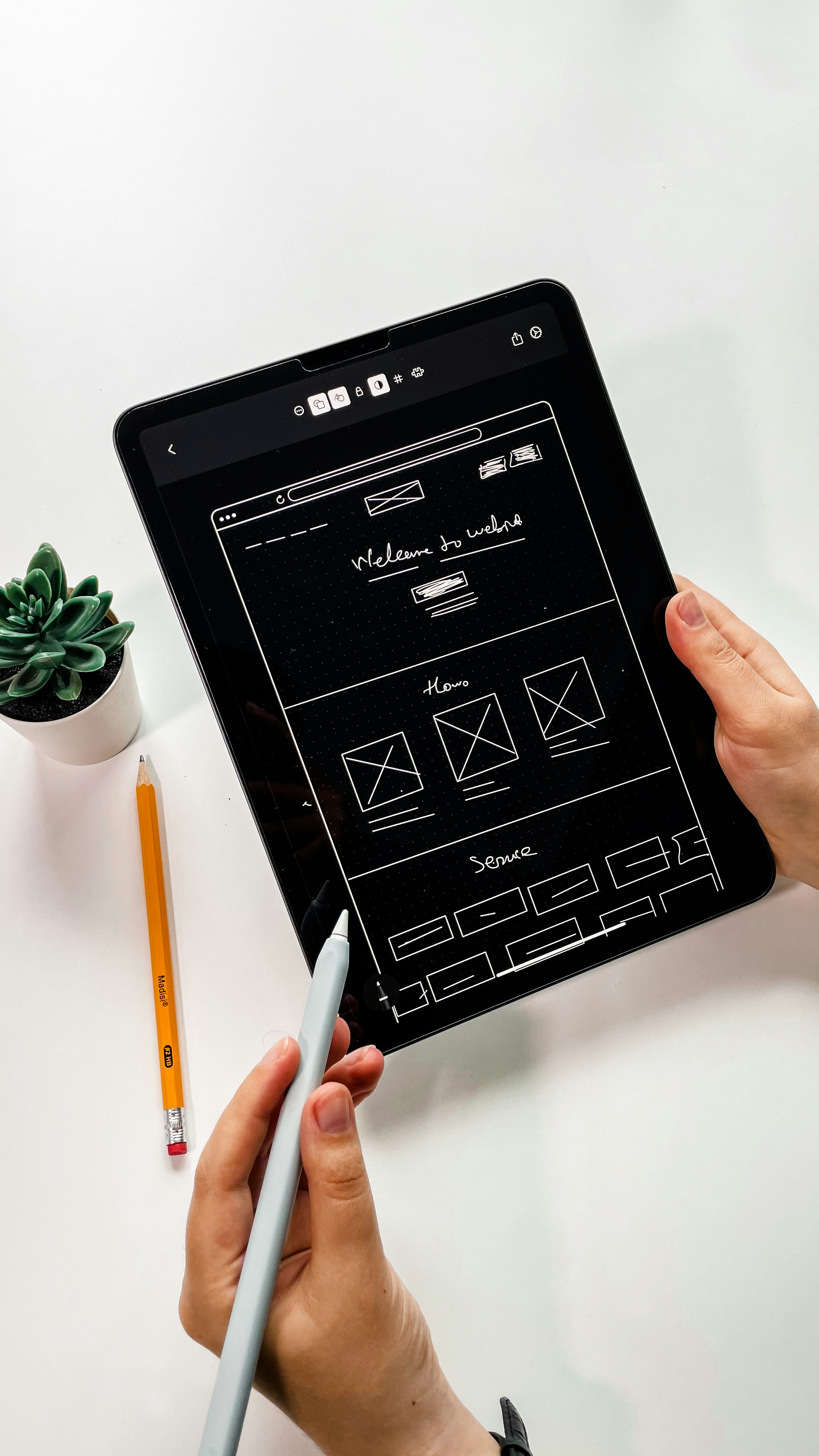
Uncovered UX
F.A.Q.
How do you balance business goals and user needs?
I see them as connected. When products are easier to understand and genuinely useful for people, they usually perform better for the business too.
Why do you focus on clarity and behavioural design?
Because people are already overloaded with information online. I’m interested in making digital experiences feel calmer, clearer, and easier to navigate.
How do you measure UX success?
A successful experience feels intuitive, reduces friction, and helps users complete tasks with more confidence and less confusion.
What makes an interface feel intuitive?
When people don’t have to stop and think about how to use it. Good interfaces guide attention naturally and make actions feel obvious.
How do you approach synthesizing insights from user interviews or usability tests to make fast, actionable design decisions?
I start by looking for recurring patterns rather than focusing on individual comments. I group observations into themes, identify the biggest friction points, and connect them back to user goals and business objectives. From there, I prioritise the issues that have the greatest impact and turn them into clear design recommendations or hypotheses to test. The goal is to move from raw feedback to actionable decisions as efficiently as possible.
I hope to speak to you soon!